July, M. (2007) "No One Belongs Here More Than You" Edinburgh. Canongate Books Ltd.
Wilde, O (1988) "Wilde, The Complete Plays" GB. Cox & Wyman.
Janfamily, (2005) "Plans for Other Days" London. Booth-Clibborn Editions.
Berger, J. (1969) "Art and Revolution" London. Writers and Readers.
Buszek, M. (2006) "Pin-up Grrrls: Feminism Sexuality, Popular Culture" GB. Duke University Press.
Gabor, M. (1976) "Pin-Up, A Modest History" London, Macmillan Press.
Ehmann, S, Hubner, M & Klanten, R. (2007) "Tactile: High Touch Visuals" Die Gestalten Verlag.
Perr, M. (2007) "Hand Job: A Catalog of Type" Princeton Architectural Press.
Ryan, R (2007) "This Is for You" London. Sceptre.
Tomine, A. (2007) "Shortcomings" London. Faber and Faber.
Anderson, W. (1999) "Rushmore: Screenplay" London. Faber and Faber.
Anderson, W & Wilson, O. (2002) "The Royal Tenenbaums: Screenplay" London. Faber and Faber.
Mulvey, L. (1989) "Visual and Other Pleasures: Collected Writings" London. Palgrave Macmillan.
Doane, M. (1999) "Femmes Fatales: Feminism, Film Studies and Psychoanalysis" London. Routledge.
Barthes, R. (New ed. 1993[1973]) "Mythologies" London. Vintage.
Duncombe, S. (1997) "Notes from Underground: Zines and the Politics of Alternative Culture" Verso Books.
Himpe. T. (2006) "Advertising is dead. Long live advertising!" Thames & Hudson, London.
Fletcher, A. (2001) "The Art of Looking Sideways" London. Phaidon Press.
Shaughnessy, A. (2005) "How to Be a Graphic Designer, Without Losing Your Soul" London. Princeton Architectural Press.
Coupland, D. (1992) "Generation X" London. Saint Martin's Press Inc.
Clowes, D. (2006) "Art School Confidential" Fantagraphics.
Clowes, D. (2002) "David Boring" Johnathan Cape.
Swinton, T (Author), Mills, M (Editor) & McGinley, R (Illustrator). (2005) "Thumbsucker: Photography from the Film by Mike Mills" Iconoclast Press.
Noble, I & Bestley, R. (2005) "Visual Research: An Introduction To Research Methodologies In Graphic Design" AVA Publishing.
Lupton, E. (2006) "Design It Yourself" London. Princeton Architectural Press.
Salinger, JD (1964) "Raise High the Roof Beam, Carpenters: Seymour, an Introduction" England. Clays LTD.
Baines, P. (2005) "Penguin By Design" Allen Lane.
Wig-01. (2004) "Graphic Poetry" London. Victionary.
Solana, G & Boneu, A. (2007) "The Art of the Title Sequence: Film Graphics in Motion" London. Collins Design.
Gravett, P, Mahony, E & Pace, K. (2007) "Cult Fiction: Art and Comics" GB. Hayward Gallery Publishing.
Gauld, T. (2006) "Three Very Small Comics Vol: 2"
Hyland, A (Ed) (2006) "The Picture Book" Laurence King Publishing.
Fabor, L & Walters, H. (2004) "Animation Unlimited: Innovative Short Films Since 1940" Laurence King Publishing.
Monday 31 March 2008
Exhibition List:
Cult Fiction Art and Comics, Leeds City Art Gallery. (9/10/2007)
Thomas Schutte, Henry Moore Institute, Leeds. (9/10/2007)
Light Night, Leeds. (12/10/2007)
-Leeds Metropolitan Gallery, “A couple lie in bed all night, remembering and singing every song they know”.
-“Aglow. “Exp 24 presents an evening of historic visionary film””
Aurora Film and Animation Festival, Norwich. (7-11/11/2007)
Leeds International Film Festival. (7-18/11/2007)
- Darjeeling Limited (Preview)
The Quay Brother's Installation, Leeds City Art Gallery (10/01/2008)
The Northern Art Prize, Leeds City Art Gallery. (18/01/2008)
Photography Prize 2008, The Photographers Gallery, London. (12/02/2008)
Evolution 2008, Leeds. (23 -24/05/08)
- Presentation: The Loud Objects
- Presentation: Michaela Grill
- Installation: Jennifer West
- Installation: Iris Garrelfs
- Performance: Murcof
Sunday 23 March 2008
Emmanuel Polanco

I found some new work by Emmanuel Polanco. I first saw his work in 'Illustration Now' and I have loved it ever since. I find him to be an important influence upon a lot of my collage work, his work taught me that collage can have very graphical aspects to it.
So in relation to one of mine:

I am able to create solid lines with coffee, and the graphic patterns of the inside of envelopes appearing in the collages. I loved doing these, even though I always thought I hated collage! as I haven't done any for a while I am hoping this will be something I could explore within my Illustration elective which is coming up after the holidays.
For me, I think collage is even more relevant as a way to merge my taste for traditional animation, illustration and photography.
Joe Sacco
JOE SACCO
Joe Sacco is a Maltese comics artist. His work, although in the comics genre, often has journalistic and reportage elements to it.
His book “Palestine” is a result of his travels to Palestine and Isreal, it is a collection of short and long stories that he came across in his time there.
I think his work is so interesting, because it completely contrasts the common misconception and stereotypes surrounding Comics and Graphic Novels. It proves that you can use non-traditional formats to explore profound issues. I think something like this could actually make such subjects more accessible for people. In this respect, Joe Sacco is completely unique in his work.
Sacco’s work is realistic and true to the subjects and stories he is covering, I think this again, is another important distinction between his work and the pre-conceived ideas surrounding comic books.
Sacoo also illustrates ‘American Splendor’, Harvey Pekar’s long running comic series. Which gives him the opportunity to escape from the harsh realist world of his own comics.


Saturday 22 March 2008
2-d 3-d
I found this image by Jan-Frederic Goltz on his website. 
I love images that seems to create shapely forms within 2-d, especially forms that cannot be named, therefore seeming harder to achieve! Contour lines on maps things like that.
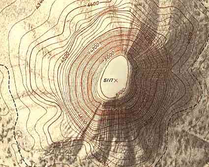
And of course this would include:

Whilst this apparently "presents exactly 100 successive pulses from the first pulsar discovered" the lines certainly create this rippling 3-d form.
I do wonder is the first piece would achieve the same effect in black and white. I think perhaps at some point all our brash vector images are going to start to look far too passe. In comparison, the Joy Division Unknown Pleasures Album artwork is timeless, it still looks very modern now and is somewhat a mediocre between the contour lines and the coloured work.

I love images that seems to create shapely forms within 2-d, especially forms that cannot be named, therefore seeming harder to achieve! Contour lines on maps things like that.
And of course this would include:
Whilst this apparently "presents exactly 100 successive pulses from the first pulsar discovered" the lines certainly create this rippling 3-d form.
I do wonder is the first piece would achieve the same effect in black and white. I think perhaps at some point all our brash vector images are going to start to look far too passe. In comparison, the Joy Division Unknown Pleasures Album artwork is timeless, it still looks very modern now and is somewhat a mediocre between the contour lines and the coloured work.
Be Kind Rewind.

I saw Be Kind Rewind at the cinema not so long ago, despite rumours that it wasn't very good. If we are reviewing and receiving it as a Michel Gondry film then yes, it isn't perhaps the sort of thing you would expect: the narrative flows in the traditional sense, the idea (whilst unlikely) isn't too far out to get your head around, or just appreciate for the comedic value. Whilst I love The Science of Sleep and Eternal Sunshine, when I sit down to watch these films with other people I feel a little apprehensive about it, I like them so much and I want other to like them too, but there is a very good chance it wont happen. In essence this is a film for people that don't like Michel Gondry films, I think most people will enjoy it and yes, it all ends a little too emotionally for my liking, but there are some redeeming qualities running throughout, the scene where they are shooting the film and people are dancing in the exposed rooms of a house = inspired! & the re-shooting of the Men In Black upside down car scene is something I certainly want to steal at some point. So it isn't going to be in most people's top films list, but just because you're used to something a little more, don't dismiss it completely!
Thursday 13 March 2008
"The Decapitator"
"Rad Fangorian guerilla art from The Decapitator, a UK-based street artist/culture-jammer known for graphically severing the heads displayed on major advertising media and reducing them to bloody, bony stumps.
His latest efforts include a foray into newsprint, having hijacked the London Paper’s back page Motorola ad and distributing it both by hand and via the distributor’s supply. The event was even documented for prosperity, here.
Originally found on either cpluv or ffffound, it’s seems the East London Decapitator’s work has been getting around."
From www.strangebeautiful.net
There is a flickr dedicated to his subversions here
but guess who?

Something different when it comes to advert subversions anyway, I was getting kind of sick of so-called witty responses to advert tag lines. Keeps it playful, something consistent and takes the place of numerous words.
His latest efforts include a foray into newsprint, having hijacked the London Paper’s back page Motorola ad and distributing it both by hand and via the distributor’s supply. The event was even documented for prosperity, here.
Originally found on either cpluv or ffffound, it’s seems the East London Decapitator’s work has been getting around."
From www.strangebeautiful.net
There is a flickr dedicated to his subversions here
but guess who?
Something different when it comes to advert subversions anyway, I was getting kind of sick of so-called witty responses to advert tag lines. Keeps it playful, something consistent and takes the place of numerous words.
Randoms

Another random image. But I have been seeing a lot of typographic projects looking a little like this lately. It's nice though. I think I am slightly afraid of colour in graphic contexts, but the idea of a gradient of colour works real well.
---------------------------------------

This is one i a set of Adverts for Luxor Highlighters, there are a number of other faces including Charlie Chaplin, but this seems to work the best. Traditional media that works simply because of a great concept, it seems so simple when you see it, but hard to reach.
(via http://adsoftheworld.com/media/print/luxor_highlighters_chaplin)
Stitch

I found this image in the bloggosphere somewhere, I think it was for an exhibition similar to the 'subversive stitch' exhibitions. Anyway, it caught my attention as something grapically strong, yet created with traditional technique. It reminds me a lot of the duvet set i stitched in foundation, the idea of using sewing in a modern way, i like!
Sunday 2 March 2008
I have had little time to think because of the busy competition project so I still really don't know what I want to do for the next brief, all the ones we were shown were totally uninspiring and / or had a bad rep.
I have an idea for a film but I really don't know if my heart's in it, generally I just don't know what to do.
I have an idea for a film but I really don't know if my heart's in it, generally I just don't know what to do.
Subscribe to:
Posts (Atom)
