Wednesday 30 January 2008

hellovon


smoke font by Hellovon, it's lovely, and kind of breaks away from the strong graphically led fonts that everyone seems to be making at the moment.
I would like to give something like this a try, looks super difficult though.

Monday 28 January 2008

inspiration folder


I've had an 'inspiration folder' on my computer for a while, so i thought i'd show some pictures from it...
Some of the images are old, so i have no idea about their context.
The first one is a kind of mounted paper shredder. I basically like the idea of displaying something so out of context that it creates new meaning, what has been shred? so many 2-d pieces of work are easily dismissed by their lack of structural, physical presence in an area, and whilst i am sure this serves as an installation in itself, the idea of displaying 2d work in a more sculptural way interests me.

The second 'neo deo' piece is something created out of perspective. I created something along these lines in foundation, but whilst this could create it's own font, this is a completely innovative way to display it. I like the idea of playing with perspective, where the intended result can only be seen from one point of view.

I like this joshua ferris book cover. I like the muted tones and the illustrated type that does have this definate structure to it, in shape and in content!

The fabric skull has a contrasting element to it, the crafting of the pink fabrics and the sculpture and the imagery of the skull. I guess materials can help to reinvent objects and take things from traditional contexts.

I love this photo 'looking in' to a train scene. It's completely 'of the moment' and flukish, and i always think is seems so surreal when trains temporarily run parrallell at night, this fleeting moment where it seems ok to just look because soon one of us will overtake.

The last image is for a fashion shoot, i just loved the willy wonker (esque) scenery, but with a more limited and subdued tones. It is pure illustration in installation.

library of congress


I found the The Library of Congress' flickr today, haha, there are some pretty great pictures on it, including this one of a woman aircraft worker, who manages to look so glamourous whilst checking electricals! this goes in well with the essay i plan to do for my Gender studies elective about the history of the pin up, which is bound up with the roles of women during the war.
super stuff

Tuesday 22 January 2008


I like this. It's a film about how words and letters are an attraction in their own right, i mainly like the retro look it has about it, and the different perspectives they show us to see the different shapes. I lke the way the words and letters seem so much more important on their own, taken out of a literal, bookish context, they become more playful, and perhaps make people think about something that we just look over. I'd like to create something like this.
see it here

douglas coupland

I really like coupland's stories, and i knew that he was artist too, but i guess i kind of forgot about it until now.
This is called "Fifty Books I Have Read More Than Once"

Which appeals to me as an idea, but also through sheer mass and scale, adding gravity to that statement. I also admire the way illustrative or print images, could be combined with shape and sculpture. Sometimes i feel like having an image at the end of a project seems to undermine all the work that can lead up to that one image, purley because it stands flat on (often) a small piece of paper. This piece really makes me think about how important backing, and evironment is to images, how they can really change the medium.
I suppose it is much like putting a drawing in a frame, in the way that putting it in a frame makes it something to be looked at.

Gah


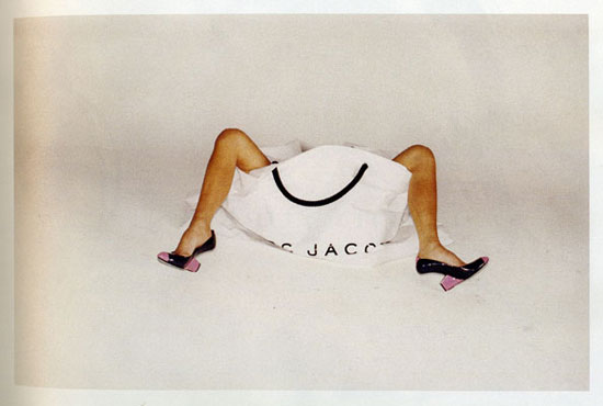
I like the new adverts for Marc Jacobs, but oh god, why does victoria beckham have to be in it? i thought everyone disliked her anyway?

Some kind of image overhaul i guess. i do generally really like photographs that cut the body in half,

Friday 18 January 2008

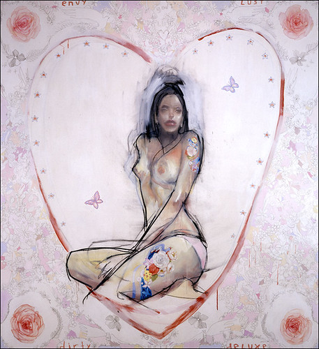
Antony Micallef


I was first introduced to Antony Micallef in an article in The Face (rip) whilst i was doing my GCSE's, I then based much of my exam work on him and never really got over it.
He used to be a graphic designer, which is something you can tell through his use of block colour and shapes, he is also very much influenced by Japan, which much of his work refers to: the common brand logos appear in his work, the bubblegum culture references, but something i really like is the paradox this has with the subjects he likes to tackle. He paints the bubblegum pop culture, with the seedier undercurrents, creating a kind of 'visual friction', it has a complete truth to it, most big brands and countries have their more sinister sides.

Comic creation.

Speaking of Barry Kitson's comic production images I saw this:

on a blog which shows Craig Thompsons documented sketch images of "Carnet de Vogage".
The images are a little less detailed than Kitson's but they're lovely and are an insight into how a graphic novelist works, and makes his way through creating a story both visually and through traditional storytelling.

Zines


I have been reading this book lately, it basically outlines the background of zines, focussing upon the political and social reasons for why zines came about. It also explores the relationship between zines and subcultures, especially punk rock.
The book looks at the kind of mini-community created by zine writers and the more personal reasons for wanting to create one. It looks at ideas of identity, like the need to belong, relate and celebration of the individual. It also looks at consumption and community.

I was thinking about creating a zine for my gender studies elective, i'm not sure whether it will happen, but it was still a good read (though could've done with a few more images)

Barry Kitson lecture.

Went to the Barry Kitson Lecture yesterday, it was really good, i like a lot of comix but i'm not really into 'superhero' or sci fi comics, but it was still really nice to see the different stages of making the comic book. I was especialy in awe of all the pencil and rough drawings, which were just amazing! and to think he draws everything from imagination too! I really like the graphical look of the finished product, i just never considered that they can from such delicate beginnings.
It sounded like it is hard work to be a comic artist, especially when you work on issues rather than books.
Anyway, it was just nice to hear about something like this, and a career that not many people have or really know about.

Wednesday 16 January 2008

godmonkeyrobot


I love the apparitions, so i don't know why i haven't come across this video before my favourite bit is actually the beginning with the globe spinning, it seems to be created using maps then the seas painted on. Looks like the old medieval maps that used to have little intricasies, i mean this bit:

paper animation


I got shown this a while ago and man you can just see how much effort it will have took! there are so many layers of paper and reminds me of the paper sculptures we had to make in foundation. I love layering up textures and different papers within my work but never to this huge extent, i think the idea of pattern and colour within this film is so aesthetically pleasing and reminds me a lot of the digital animations everyone seems to be making at the moment, but knowing that it's physically there makes it so much better.


I like the fact that this film has a really sinister edge without being obvious and trite. mainly horror kind of films annoy me so much because theyre just laughable, i especially like the opening bit, and the hues they've managed to achieve, seem to create a vintage old aesthetic, which is something i seem to end up doing in a lot of my work, but the subjects and the way in which it has been created makes it look up to date.

chelsea girls


I like this! mainly just the shapes spinning on the record must've been difficult to get that in the right place. I like the colours as well, I think that songs with an electro edge work better when creating an animated video, but this is something to think about when creating more music videos, I am also really liking the idea of animating existing within the 'real world' but not in the kind of claymation sense. nice!

animation


found this on youtube, it's a stop motion film, created with plastic containers and coloured water to create a kind of retro computer style. I like it, reminds me of tetris and old computer games like that. I like that it mirrors something digital but that it exists, also goes to show what a difference the sound can make!

Monday 14 January 2008

picture this


Picture this is a talent competition on channel 4, each week the contestants get a couple of photography briefs and have to exhibit their best photos to the judges, the winner gets their own exhibition and a book. I hadn't seen it before, but this week they took them to a polo match, a hackney council estate and a protest at heathrow, to try documentary photography. My favourite was the young girl, who manipulated each situation to create a portrait photo, that were both realistic but somehow dramtic. This is probably my favourite type of photography, turning banal surroundings into something unusual, which is maybe why i like taking photos at night, things always look dramatised at night!

Louis Theroux

'Behind bars' was on last night, and it just amazes me how Louis Theroux can turn a kind of intimidating situation, into something light and open. I was amazed at how honest the people were that spoke to him and welcoming they were. I liked the way he documented the relationship between the prison officers and the inmates, and how the group dynamics worked within the prison. I found it intriguing how it made you warm to people who have commited such awful crimes, and how eloquent they were in describing their experiences, perhaps i just settled in stereotypes because of my ignorance, but getting rid of stereotypes is something Theroux does so well in his documentaries.

Art Gallery


I went to go have another look at the Quay Brother's film and installation at the Leeds City Art Gallery before it gets taken down. It's a piece based upon the myth of Opheus and Eurydice, there was an installation 'optical box' where you can peer in through the 'telescope' windows and see the world within, the effect of the light seemed to create the effect of the light hitting water and us beneath it, a kind of animation through light! I want to kind of think of that when i make other films, the idea of animating around the objects to give the effect of other movements.
The film shown was a ballet around the subject, it was dark and tragic, full of nice effects like the thick 'fog', i liked the blackness of it all, but how it retained it's tones, i also thought the music was fitting, a little 'antony and the johnsons' esq.
They're also showing the contenders for the Northern Art Prize at the moment. I have to say for me there is only one person who could win, Dan Holdsworth.http://uk.wrs.yahoo.com/_ylt=AhxlIsBYEhgh4925u9YOonFWBQx./SIG=125lee3d2/**http%3A//www.nmm.ac.uk/upload/img_400/
His pictures surrounded the room, and the other artists more questionable satsuma structures were within. Anyway, unbelievably most of his images were photographs, but he acheived the best effects and colours though using extensively long exposures, i especially like the patterns of the stars, i have seen that before and had a go in summer when all the shooting stars were falling, but these were just lovely. It was hard to believe they weren't paintings!

I'm not there

I got an e-mail to say my 'friend' was up on the site and here it is! next to Laura's, giving me one set of painted nails.

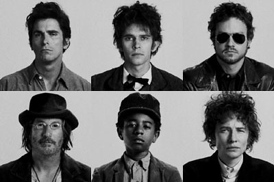
I went to see 'I'm not there' on friday night, a kind of unusually told film about the earlier life of Bob Dylan. It was really great! There were, I think 5 different personas, or versions of Dylan, and when the film went between the different stories, the film took on a completely different style, from black and white, dreamlike scenes favoured for the 'publicly unfavourable' dylan, to the high contrast pure white backdrop for the court dylan and western colours in the 'billy' dylan.
There were some really nice quirks to the film too, some unusual, wes anderson style shots of his wife cleaning dishes in the sink, with frames removed, and then a part where dylan sees himself floating above rooftops, but attatched like a kite by his ankle.
Cate blanchett was my favourite and most authentic dylan. Of course the film had a great soundtrack as well, for some reason i found the film (although great) to be really upsetting as well, god knows why.

Thursday 10 January 2008

http://friends.neonspice.net/


my quick effort for this
laura's blog reminded me of it! i meant to do it a while ago.
collage never scans right!

Thursday 3 January 2008

filmsssss


Saw 'the chumscrubber' recently, it's dead good.
Kind of an ironic black comedy or parody of american suburbia, reminded me a lot of Donnie Darko and Thumbsucker. Dissafected youth on pharmaceuticals. I didn't really get the on going video game reference, but it's a good film and no terribly happy endings.


Pretty persuasion, is an anti-teen movie i guess. dark, really funny and a bit shocking. Teen movies generally make me a bit sick, but this has twists and better actors.

I've watched a lot of crap films lately but these are the best.

New website.


I made a website for my friend. It has taken a while to get it together but i pretty much worked solidly on it today and yesterday and it's nearly done save for a few bits of text. I like the site, i think it works pretty well, i found it enlightening to make something for somebody because i had to put decisions into place that were someone elses and perhaps not those i would've made. It was more hard when other people do not know how web design works and ask for things to be done that are difficult and maybe a bit too time consuming, as a result this website has a LOT of pages, and was a lot of hard work (more than mine) but i am getting better at it all the time, as it is my third site now, and it's up and running.

here: www.josharmitage.co.uk